Measuring Digital Sovereignty: SovereigntyMap Put to the Test
🇫🇷 Lire en français : Mesurer sa souveraineté numérique : SovereigntyMap à l'épreuve
Testing SovereigntyMap — the new independent digital-sovereignty observatory launched by engineer Sylvain Rutten — kimoun.com scored 100/100: “sovereign”, gold label, when the French average sits around 54/100. Good news. But what really interests me isn’t the score: it’s what a measurement tool reveals when you handle it from the Caribbean, where digital sovereignty isn’t a conference topic but daily life.
An observatory that makes sovereignty measurable
Tip
A sovereignty observatory doesn’t judge your intentions: it measures technical facts — where your site is hosted, who runs your DNS, which jurisdiction your email falls under.
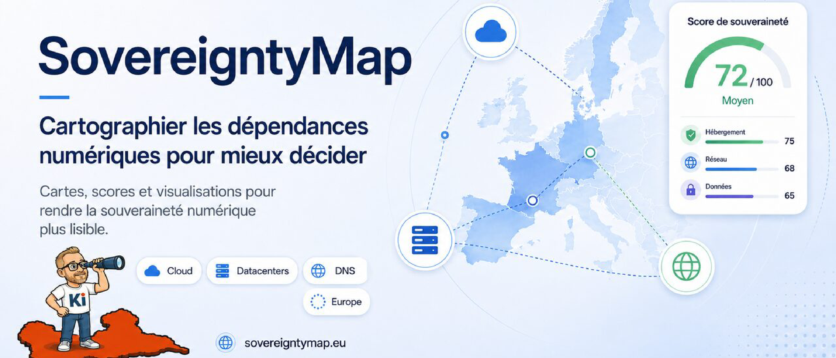
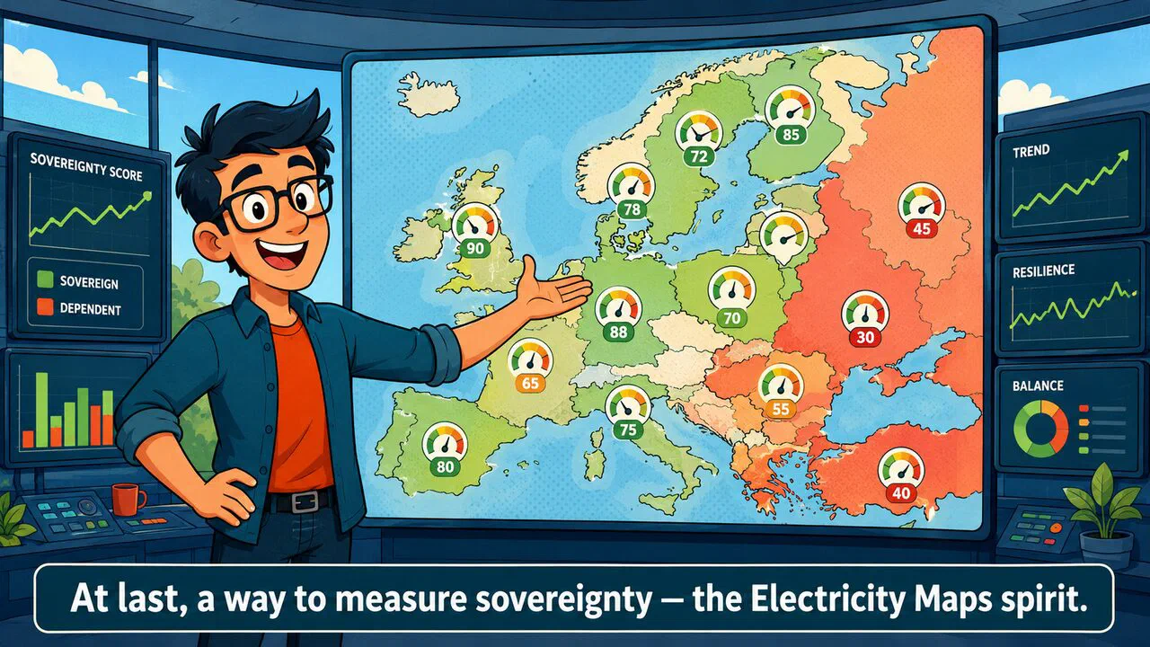
We talk a lot about digital sovereignty, and almost always without criteria. Which dependencies should you analyse? Which guarantees should you compare? How do you tell a concrete commitment from a marketing pitch? That’s exactly the gap SovereigntyMap fills: mapping an organisation’s cloud dependency the way Electricity Maps maps the carbon footprint of electricity — making an otherwise abstract issue visible, comparable and debatable.
The timing is apt. On 26 January 2026, the French state launched its own Digital Sovereignty Observatory, entrusted to the High Commission for Strategy and Planning — an institutional body whose first findings are expected in spring. SovereigntyMap, by contrast, is an independent, open project that waits for no one’s permission to measure. The two don’t compete: they light up the same blind spot. The backdrop is well known — according to CIGREF, 80% of European spending on software and professional storage goes to US companies.
100/100, gold label: what SovereigntyMap measures

A 100/100 doesn’t fall from the sky, and it puts kimoun.com well ahead: at the time of writing, across the 681 French organisations the tool tracks, the average sits around 54/100. The tool then breaks the score down by category, and that’s where it gets instructive. On kimoun.com’s profile: front-end hosting 100/100, DNS 100/100, email 100/100. Three building blocks flagged low-risk — European host and DNS, email under European jurisdiction.
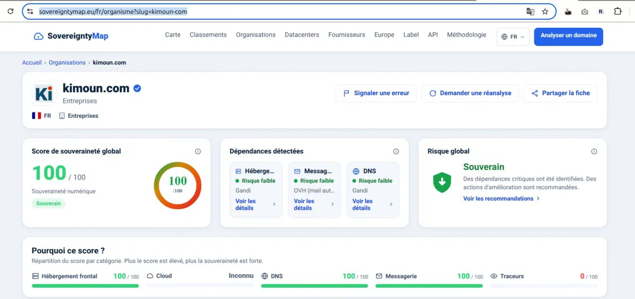
A nice detail: the tool correctly saw that my email runs at OVH, the very place where it got the hosting wrong (more on that below). Proof that sovereign email is as detectable as it is deliberate.
This score is no accident; it’s a string of choices. Hosting on European infrastructure, keeping a controlled DNS, email that doesn’t hand your exchanges to a non-European jurisdiction: these are the same principles I apply to the projects we host — reversibility, no lock-in, the client owning their code and their access. Sovereignty isn’t proclaimed, it’s built block by block. A tool that makes it visible suits me just fine.

What I flagged to the author — and he’s already fixing
I already assess my own sites and my clients’ with recognised indicators — Mozilla Observatory, Google’s tools. Digital sovereignty matters to me, so I wanted to put SovereigntyMap through its paces as soon as it launched.
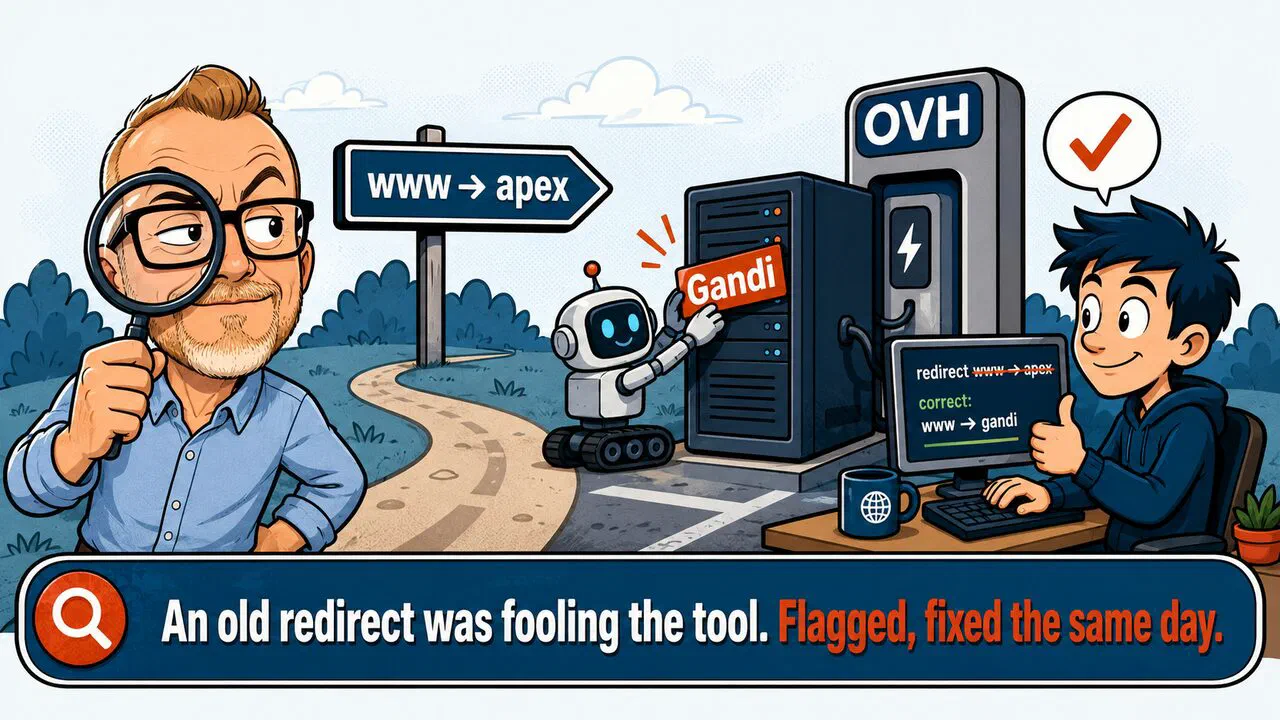
From the first test, I liked the interface and how simple the tool is. I even turned up a small bug, caused by an old stale redirect in kimoun.com’s DNS: I reported it to Sylvain. His reply, the same day: redirects will now be taken into account, “we’ll build that in”. This is exactly how an open project moves forward — through contact with real cases.
Warning
An automated score is still a surface snapshot: it reads what it detects (IP, ASN, DNS, headers), not your contracts, your backups or your recovery plan. 100/100 on the map doesn’t replace a real resilience audit.
Measure, yes — but who maps the overseas territories?
“A map is not the territory it represents."
— Alfred Korzybski, Science and Sanity, 1933
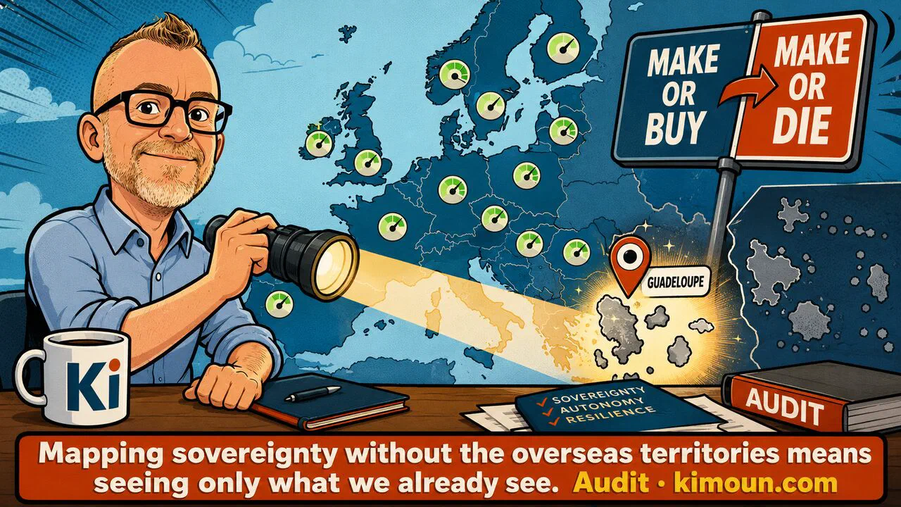
A map is never the real thing: it’s a choice of representation, and every choice encodes a hierarchy. The best-known debate on this question remains the one about projection: Mercator’s (1569), designed for navigation, enlarges Europe and the high northern latitudes and shrinks Africa and the equatorial regions; the Gall-Peters projection, revived by Arno Peters in 1973, was promoted as a “fairer” alternative in terms of surface area. Neither is neutral — a simple mathematical choice decides what gets enlarged, what gets shrunk, and what is left out of frame. A digital-sovereignty map that stops at continental Europe follows the same logic: it reproduces a centring, and the overseas territories become its blind spot.
So my one real regret is the map itself: a depiction of Europe, but without the overseas territories. And that’s a shame, because to my mind they’re precisely the most interesting angle of the subject.
The outermost regions are Europe — and its most exposed frontier on the question of digital sovereignty. Overseas insularity turns every dependency into a vital gamble. Here, the textbook “make or buy” becomes a very real “make or die”. You build your resilience locally — otherwise the business stops dead. Another thing worth pondering: France’s centralised model has recreated ultra-periphery on a network that is, by nature, a-peripheral. That’s the whole subject I dig into, from the submarine cable to the click, through to the day the Internet stops for 72 hours — and to how economic value drains off the territory via distant platforms.
Mapping sovereignty without the overseas territories is mapping only what we already see. I shared the point with Sylvain, who reassured me at once: the overseas dimension is coming to the map. Good. Because to talk seriously about sovereignty, you also have to be willing to look where it plays out the hardest.